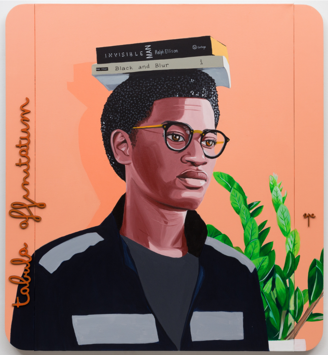
Conrad Egyir “Mitchell’s Class” oil and acrylic, mounted wood on canvas. Image courtesy of SJICA.
October 1 to February 20 – Conrad Egyir: Chapters of Light at the San José ICA: The San Jose ICA re-opens with the first and largest West Coast exhibition of work by Conrad Egyir. Egyir is a Ghanaian artist based in Detroit, working in figurative narratives of the African Diaspora. His work blends religious and West African folk iconography within domestic scenes, portraying a deep understanding of the history of portraiture. He utilizes shaped canvases and relief elements to reference stamps and postcards as metaphors for migration; journals, books, binder tabs, and chapters as metaphors for time and the archiving of ideas. In addition to paintings, the exhibition will feature a charcoal drawing, a large vinyl installation, and an interactive portrait room where visitors can build their own scene for a self-portrait. The San José ICA is located at 560 South First Street, in San José.
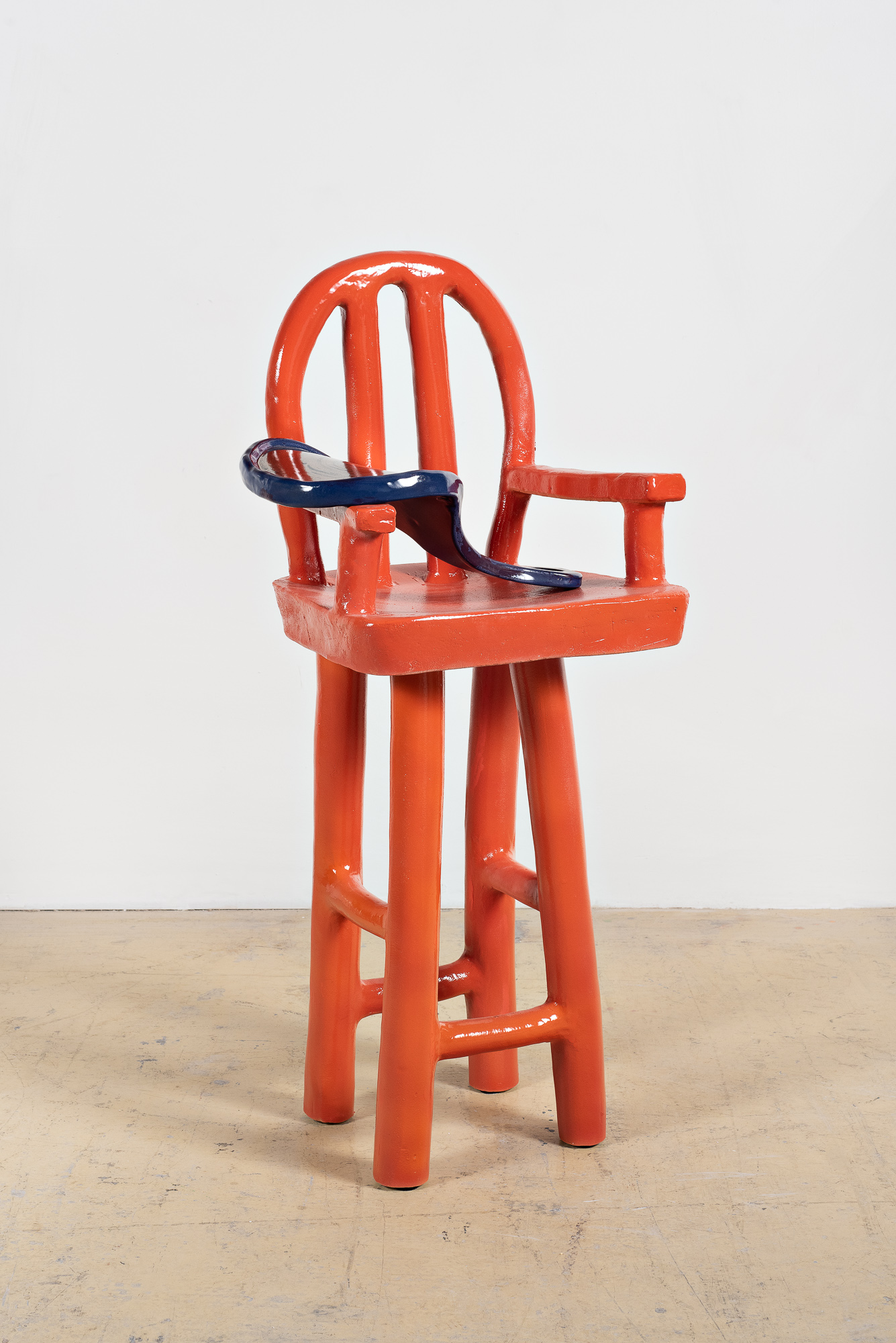
Woody De Othello “Seated Reflection” ceramic, glaze and white gold. Image courtesy of Jessica Silverman Gallery.
October 2 to November 13 – Woody De Othello: Leaving Space at Jessica Silverman Gallery: This exhibition features new works comprised of paintings, ceramic sculptures, and a large-scale outdoor bronze. It explores still life as social comment and psychological inquiry. The large bronze is in a sea of ceramic sculptures depicting mirrors, clocks and watches on stools and chairs, hanging lights, light switches, and oversized coffee-mug planters. Bearing witness to the way Othello uses clay as a spontaneous and improvisational material, these forms could be the lyrics to the instrumental jazz music that is in heavy rotation in his studio. Jessica Silverman Gallery is located at 621 Grant Ave in San Francisco.
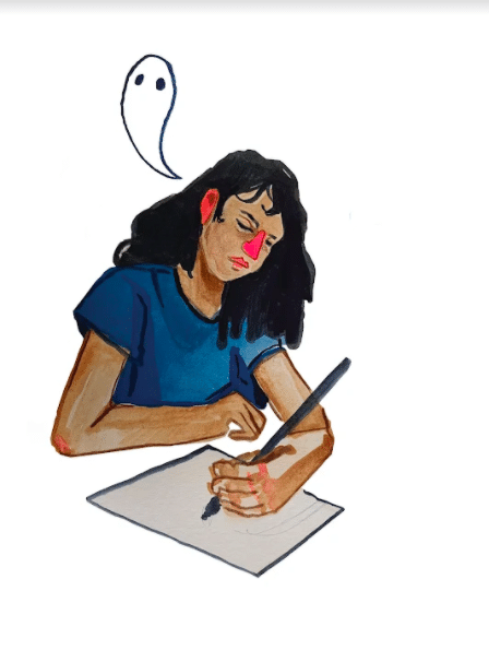
Michael McConnell limited edition Riso-print available at the event for $20. Image courtesy of Southern Exposure.
Saturday, October 9, 2-6:30pm – Monster Drawing Rally at Southern Exposure: The Monster Drawing Rally is back this year, and outdoors. Combining the energy of a monster truck rally with the creativity and brilliance of the Bay Area art community, The Monster Drawing Rally is an incredible afternoon of artmaking and fundraising. Over 100 artists create brand new work right before your eyes in a frantic race against the clock. As you spy on the creative process, you’ll see sketches morph into full-fledged artworks – immediately available for just $100 each. The event will be held outdoors on Alabama Street between 19th Street and 20th Street in San Francisco.
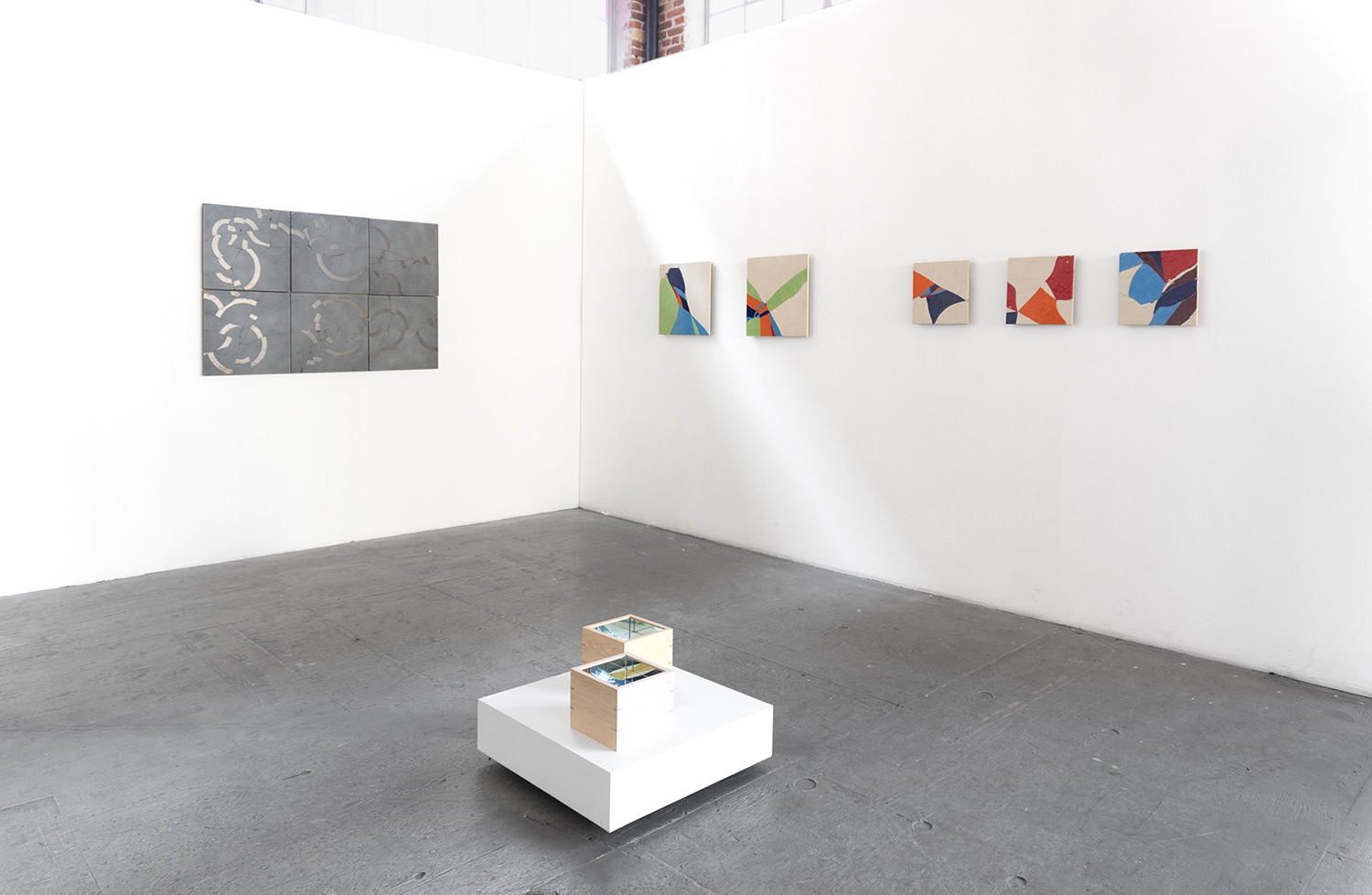
Jim Melchert, installation view. Image courtesy of Gallery 16.
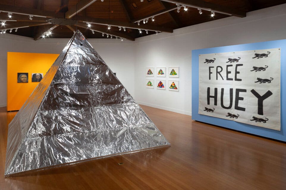
Ongoing to October 31 – Jim Melchert: Rethink, Revisit, Reasses, Reenter at Gallery 16: Over his fifty year career Melchert has cast a remarkably long shadow of grace and influence in the Bay Area art community. This exhibition is a selection of works that span from the 1970’s to present day. A powerful concept that has guided Melchert’s explorations over the past three decades is reminiscent of the Japanese tradition of Kintsugi, a process of mending something broken. In his work we see a Zen-like interaction, an acceptance of change as aspects of human life. “When clay is broken, the gift it gives you is discovering the interior structure. It’s like someone who has just made a first move in chess—it’s a challenge… you move, then the other person makes a move. Whatever I do, the tile comes back with a response.” Jim Melchert. Gallery 16 is located at 501 3rd Street in San Francisco.
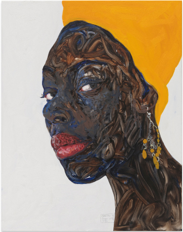
Amoako Boafo “Bella Sontez”
October 20 to February 27 – Amoako Boafo: Soul of Black Folks curated by Larry Ossei-Mensah at Museum of African Diaspora (MoAD): This solo exhibition for Ghanaian artist Amoako Boafo presents over 20 works created between 2018-2021. Amoako Boafo creates paintings that actively center Black subjectivity, Black joy, and the Black gaze. Anchored by extremely calculated brushwork combined with skillfully executed finger-painted strokes, his mark-making generates a rich visual dichotomy that produces an evocative tension between the foreground and background. Moreover, this spatial tension yields both inward and outward-looking explorations of Boafo’s subjects and the act of painting Black figures themselves. MoAD is located at 685 Mission Street in San Francisco.
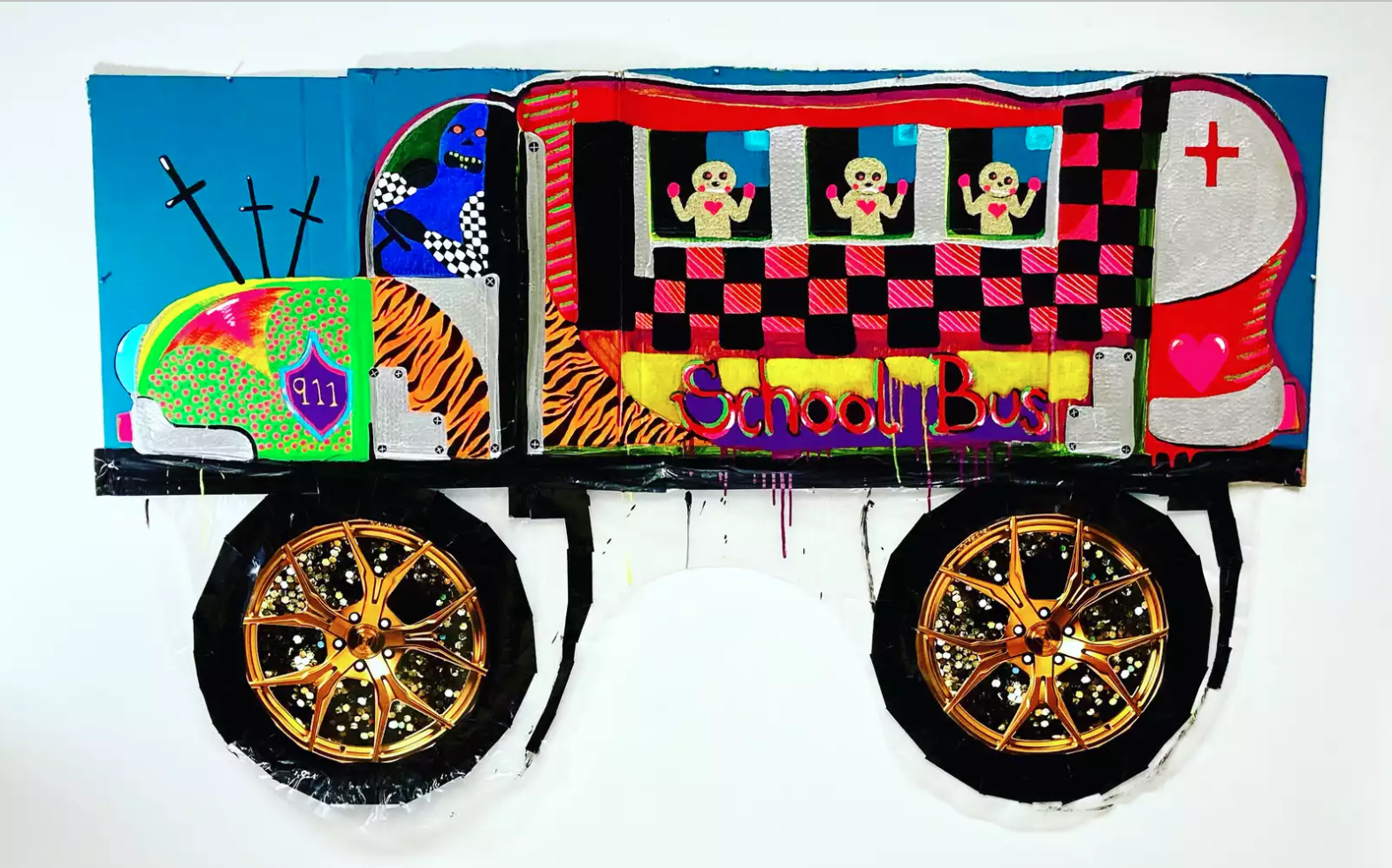
Tavares Blackmon “Bus 2” Synthetic polymer pigment, cell vinyl, acrylic on cardboard, duct tape, archival inkjet print. Image courtesy of Kala Art Institute.
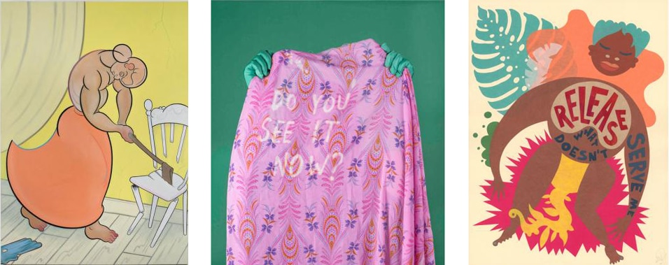
Ongoing to November 19 – Sea of Fertility – Looking at the Invisible at Kala Art Institute: This exhibition features new works by 2020-2021 Kala Fellowship and Media Residency artists: Anthea Black, Tavarus Blackmon, Alexa Burell, Elnaz Javani, Natani Notah, Pegah Pasalar, Jessica Sabogal and Shanna Strauss, tamara suarez porras, Naomi van Niekerk. Kala Fellowships and Media Residencies are awarded annually to a group of innovative artists working in printmaking, photography, painting/drawing, installation, video, sound, performance, and mixed media. This cohort of artists was selected by a Kala committee and two jurors, Media Artist alumni Veronica Graham, and Jovanna Venegas, Assistant Curator of Contemporary Art SFMOMA. Kala Art Institute is located at 2990 San Pablo Avenue in Berkeley.
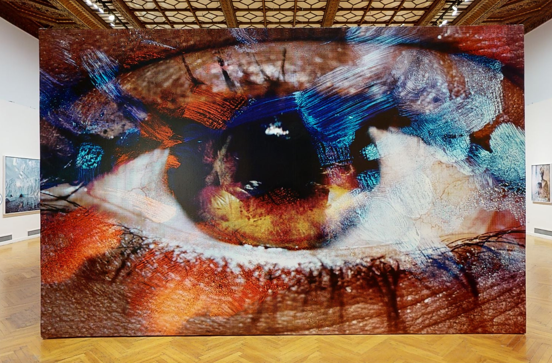
Tabitha Soren, installation view. Image courtesy of Mills College Art Museum.
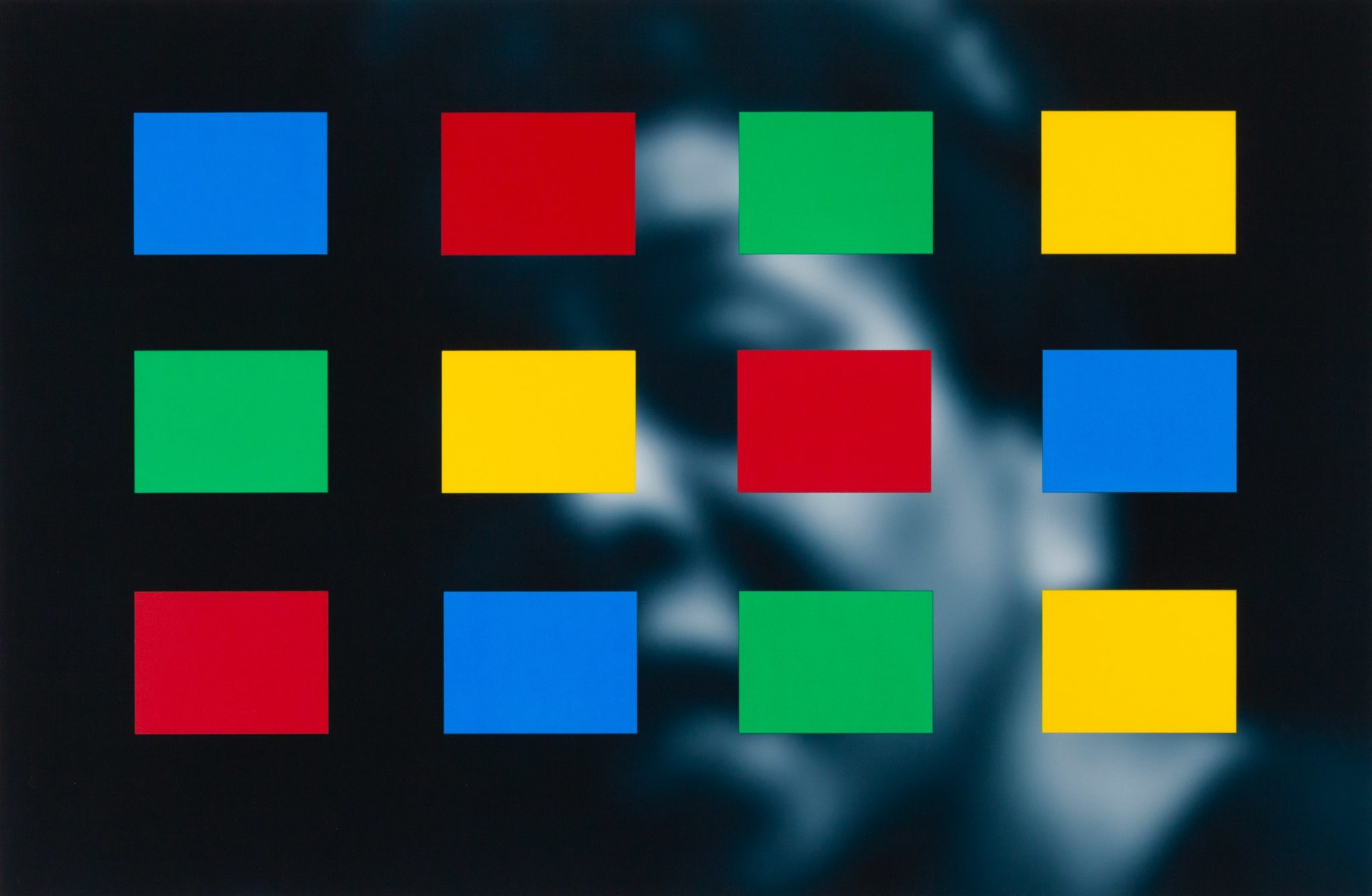
Ongoing to December 12 – Tabitha Soren: Surface Tension at Mills College Art Museum: Using an 8×10 large-format camera, Soren shoots iPad screens under raking light to reveal the tactile trail we leave behind. The images beneath are a compendium of private and public experiences, from a young child blowing a kiss goodnight to her mother, to the protests that followed the fatal 2014 shooting by police of Michael Brown in Ferguson, Missouri. The images she chooses are drawn from web searches, text messages, social media content, and personal pictures, raising questions about authenticity and exploring the difficulty and lack of desire to distinguish between reality and fiction. Soren’s images serve as a poignant meditation on the role of digital devices in society and offer a reminder of the traces, both physical and digital, that we leave behind when using them. Mills College Art Museum is located at 5000 MacArthur Blvd in Oakland.
October 6, 7–8:30pm: Tabitha Soren and Sarah Thornton in conversation, Danforth Lecture Hall.
