Yunhee Min and Roe Ethridge. Photo: Ned Bonzi
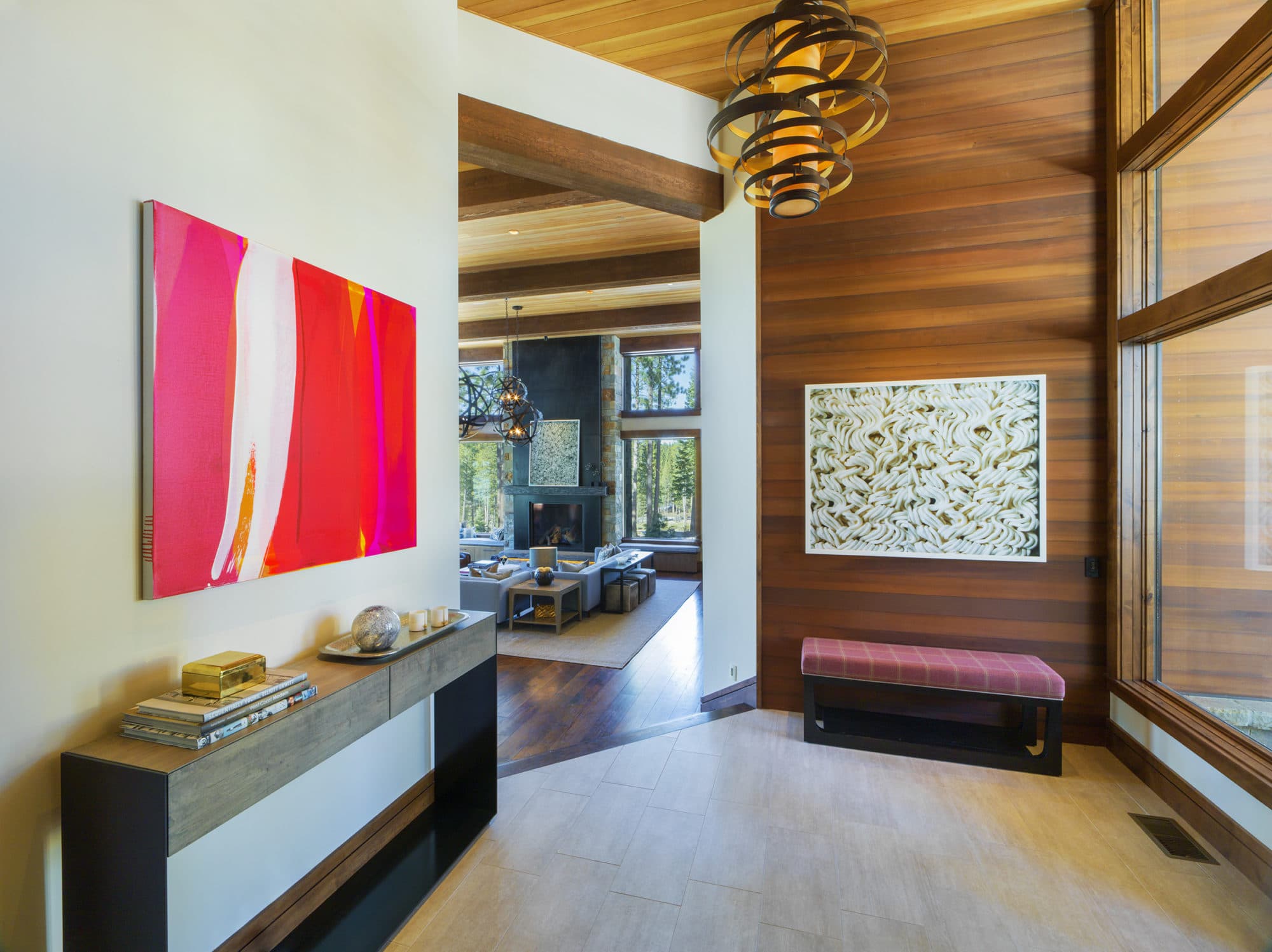
Incorporating art in this family vacation home in Martis Camp was a priority for our client. After working with them for several years to acquire works for their primary residence, they understood the impact of living with contemporary art. Since the house wasn’t built yet, we were able to literally integrate the artwork and to do some site specific commissions. It’s a beautiful home with a huge open central space with floor to ceiling windows looking into the changing landscape. With that view, the art had to stand on it’s own, be bold and appropriately scaled. As with all of our clients we like to have a clear criteria that guides how and what they collect. This couple is young, smart, curious and adventurous. Their collecting focus is on emerging to mid-career artists; they want to be involved in the art of their generation.
Our clients are involved in the selection of every work of art. We talk about the work, the artist, his or her career and discuss how it makes sense in the spectrum of their collection. We have guided their interests toward artists who have an original voice and a unique way of expressing their ideas. We look for quality work by artists who maintain a regular studio practice and that have a strong exhibition history.
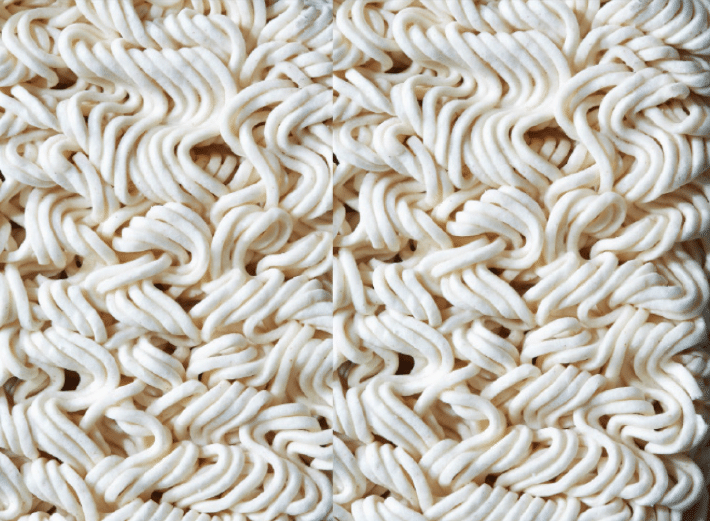
When we began acquiring work that would be placed in the Mountain house, the first piece we bought was the Roe Ethridge, Double Ramen, 2013. We had seen this work in New York and immediately thought of them. It has the whimsy that they like while still being a serious work by a critically successful artist. The work references the distinction between commercial and fine art photography and between images that are digitally altered and those that are untouched. We loved the subtle reference to ski tracks; it has the right balance of seriousness and fun.
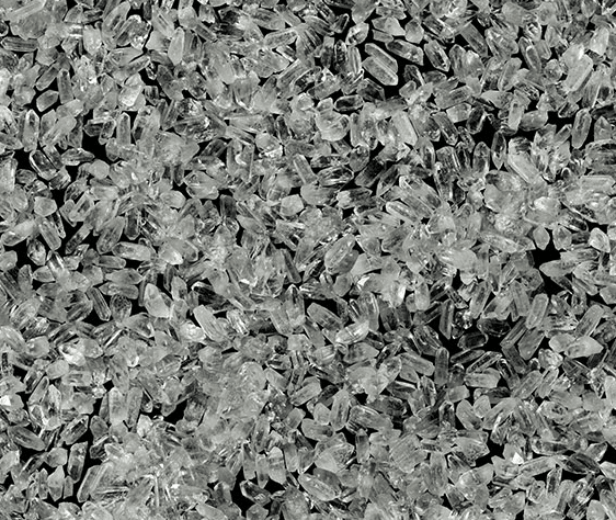
Ken Fandell, “Crystal Mess Pattern”, (detail) 2014, composite color photograph; archival inkjet paper
Ken Fandell similarly makes work that forces the viewer to look an an object in a way that we wouldn’t normally see it. Not so much a trick of the eye, but more a thought-provoking and unexpected approach. In this body of work, the artist explores the place between mysticism and popular culture as well as the natural and the manmade. His powerful work reveals the extraordinary in the ordinary. This dichotomy between the real and manmade and how we perceive images becomes central in this collection.
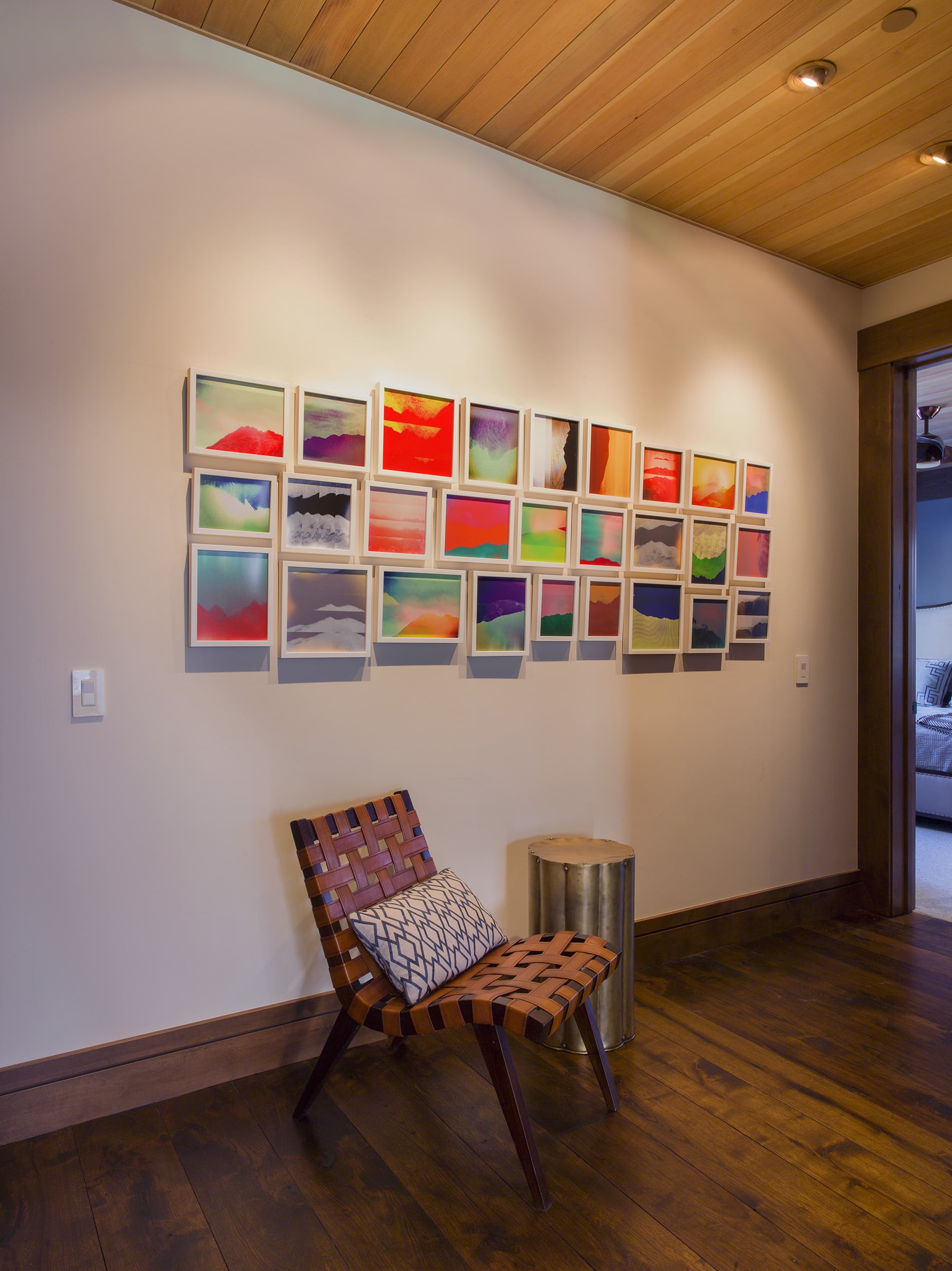
Penelope Umbrico, “Mountains, Moving: Dr. George Poundstone #23″, 2014, c-prints, installation. photo: Ned Bonzi
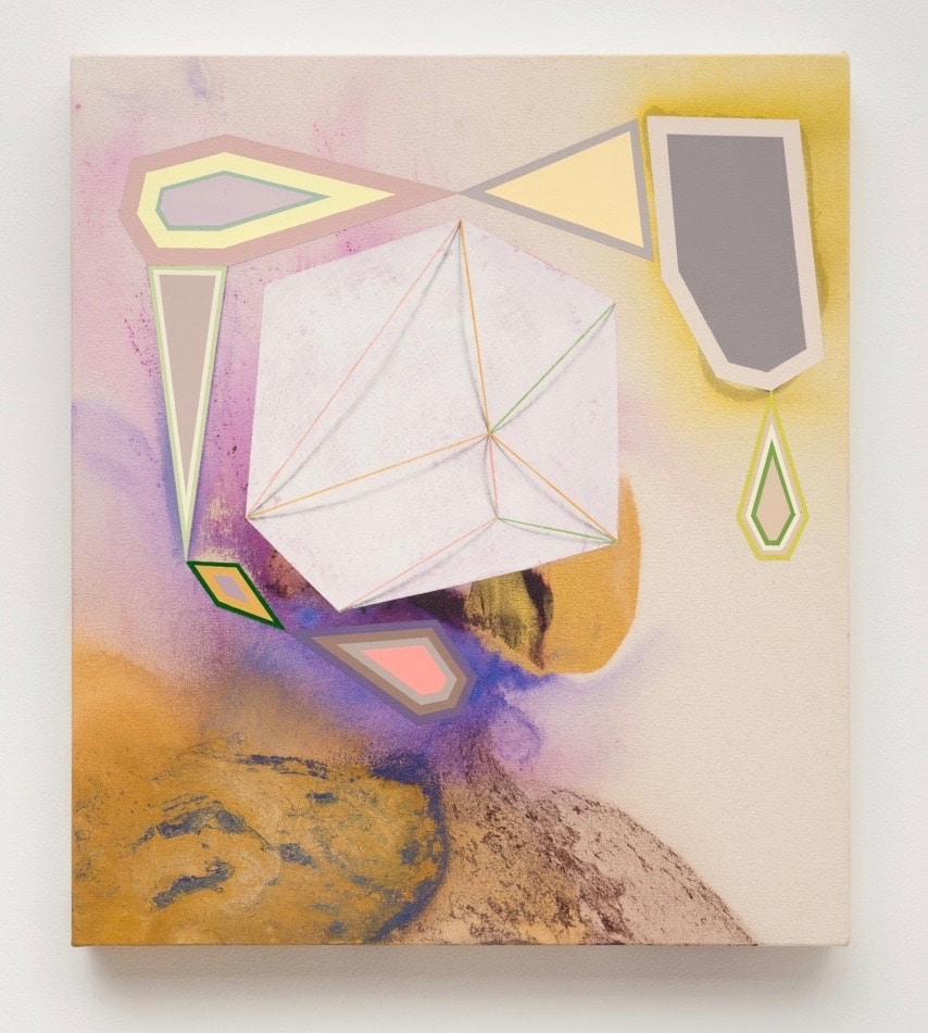
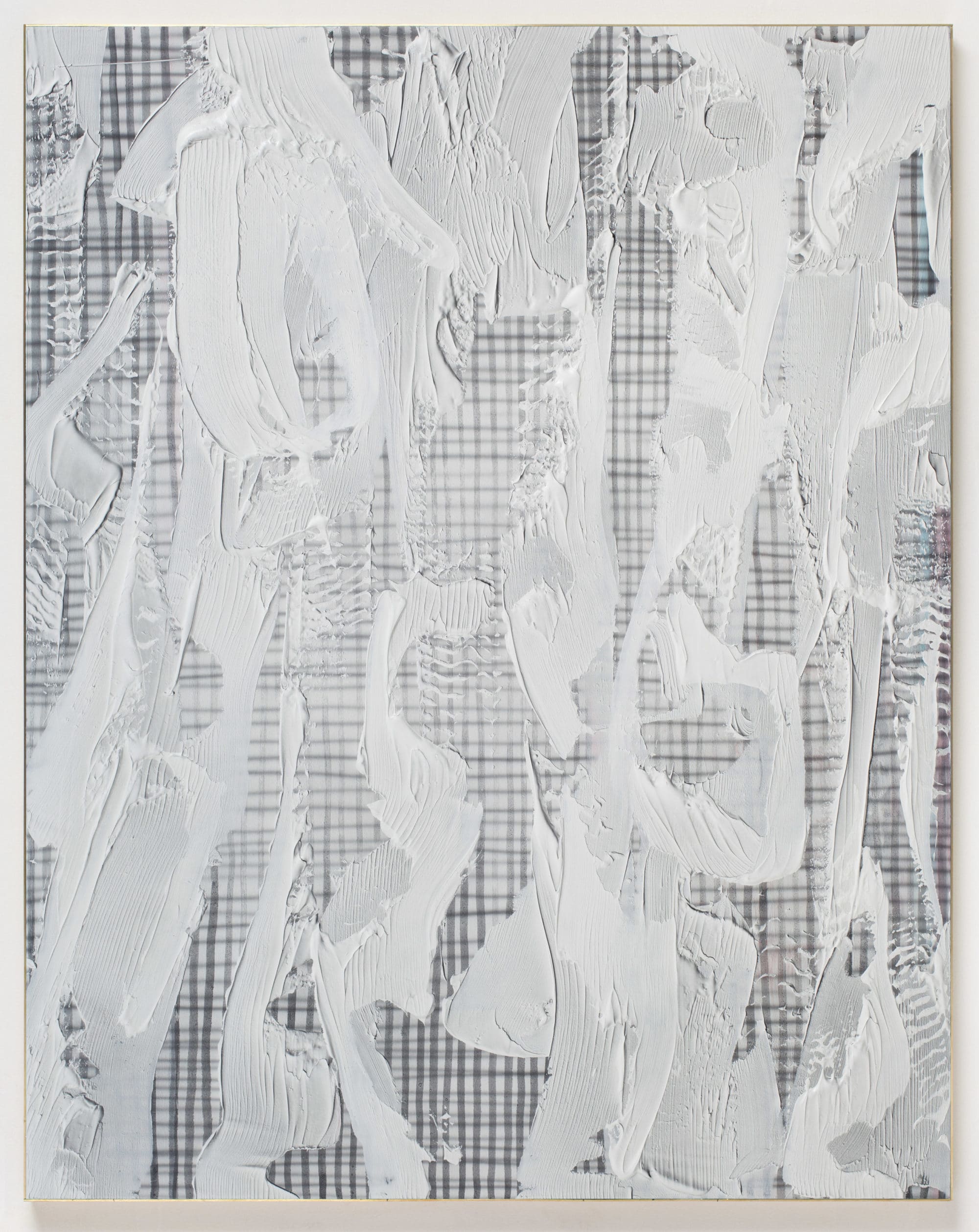
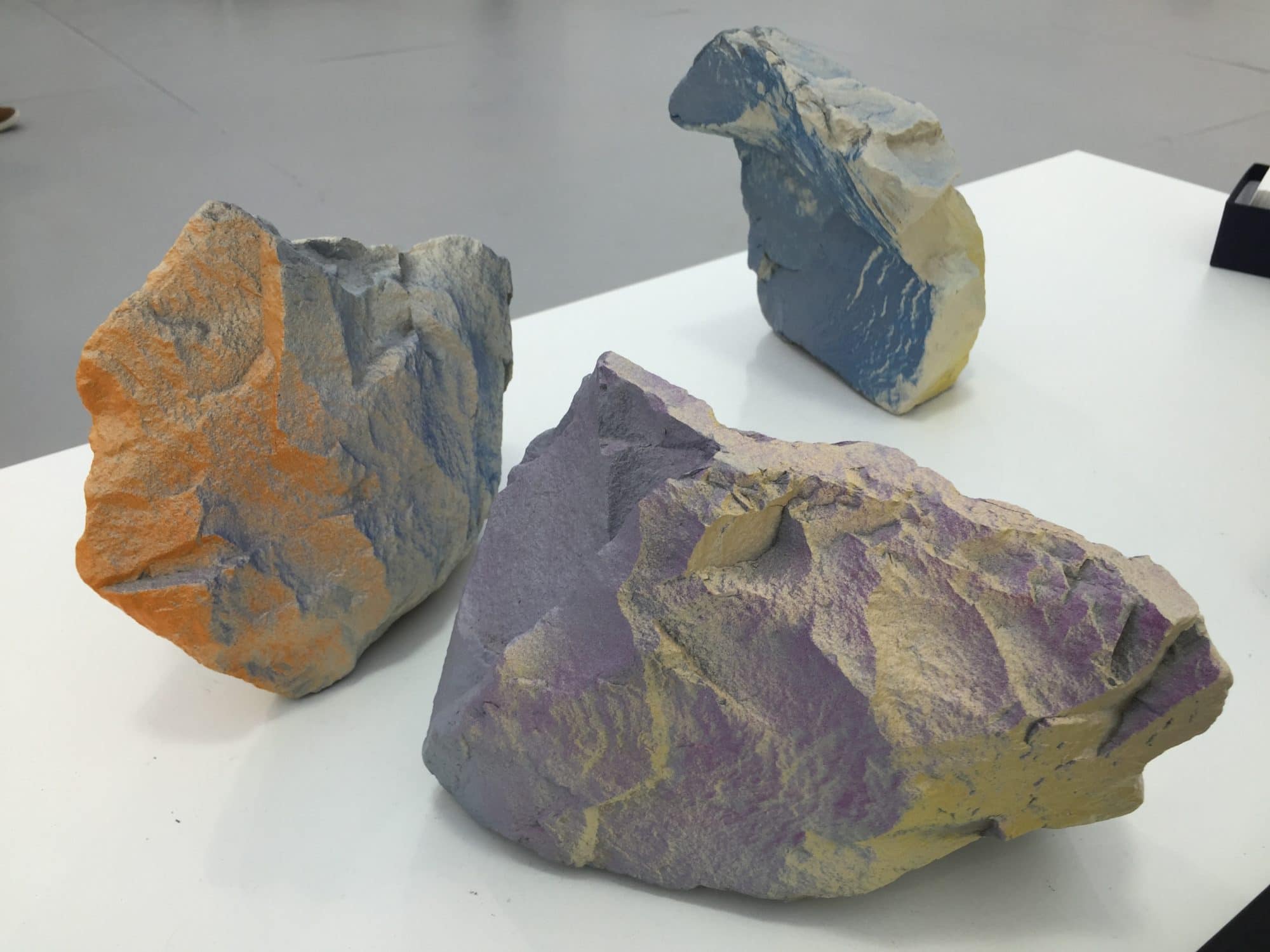
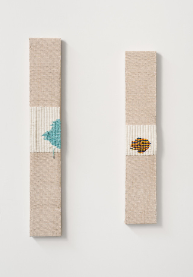
David Lloyd, Santiago Taccetti and Joe Reihsen take the unexpected to a more illusory place. In each case, the painting process activates the work in a 3-dimensional way. David Lloyd’s through a shift of flatness and depth, Joe Reihsen’s with a sculptural paint application and Taccetti, with strategic paint application on dimensional objects.
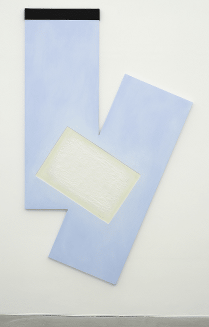
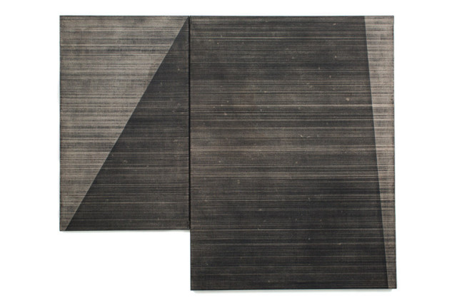
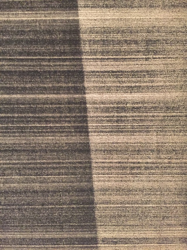
Ana Cardoso’s Compression Catches Its Shadow, 2013 and Noam Rappaport’s Untitled, 2015 are similarly activating the space around them, but also drawing the viewer in with composition. In particular, Rappaport draws attention to geometry by highlighting and the space between the two panels. He builds up the canvas everywhere except for the space where the two structures come together.
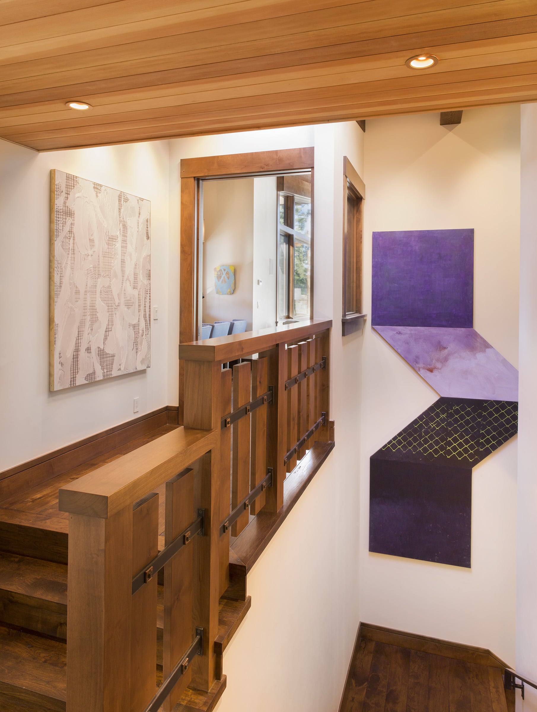
Joe Reihsen, Christian Maycheck and Ana Cardoso, installation. photo: Ned Bonzi
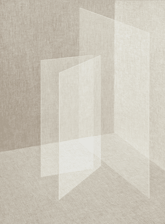
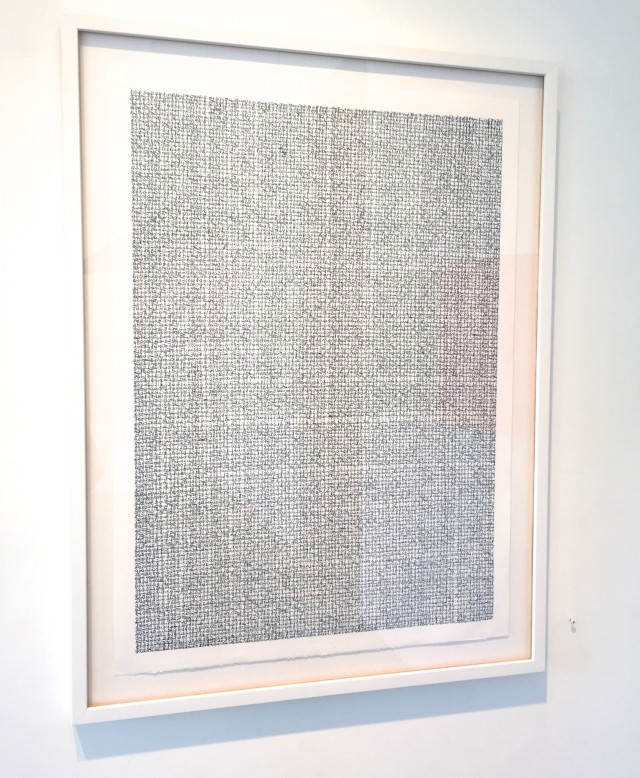
Miriam Böhm’s Unit II, 2013 has a similar approach but with photography. The artist masterfully stages, shoots, re-stages and re-shoots until the final image becomes physically impossible and visually confounding. Again, in this work, the illusory comes into play.
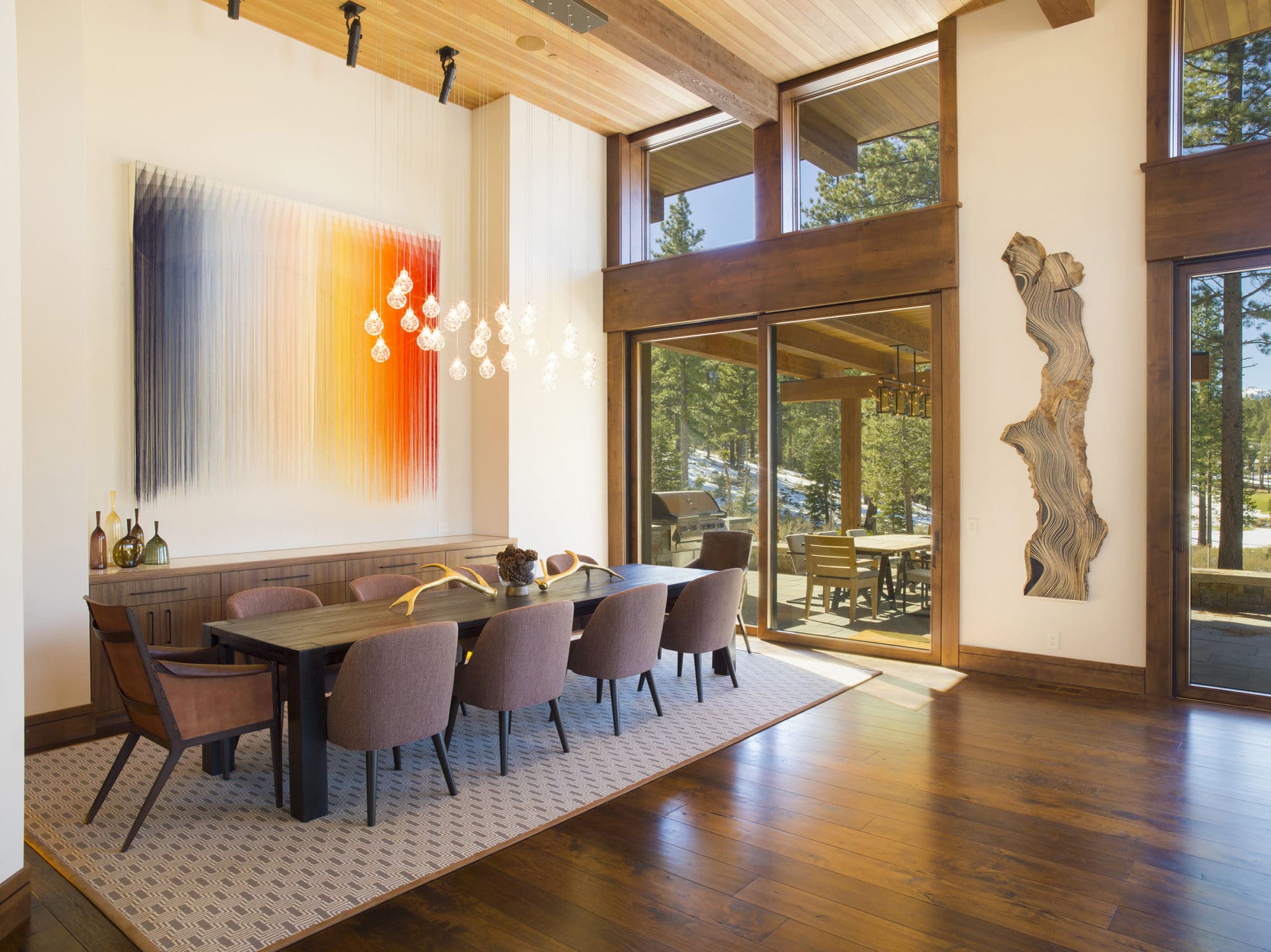
Nike Schroeder, Jason Middlebrook, installation. photo: Ned Bonzi
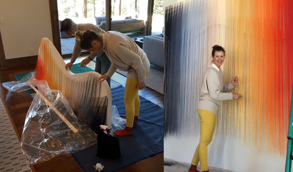
The centerpiece of the house is the commissioned work by Nike Schroeder. We showed our clients examples of her work because we felt it was both consistent with their collecting criteria and because we knew Nike would be able to make something spectacular. The artist was just starting to think about shaped canvases and was thrilled about the challenge of this new project. We talked to the artist a lot about the physical location of the house and about how the family would be using it year around. Nike wanted the work to speak to what was outside without replicating it. She proposed an asymmetrically curved canvas (referencing hills, snow) with a palette that speaks to the changing seasons. Because it is made of thread, the work gently undulates.
The interior design was by Jay Jeffers. While design and art are separate for the client, we made sure to understand the designer’s approach to the space so that the art was in harmony. And because lighting is so important for art, we worked closely with the contractor to ensure that everything had proper lighting.
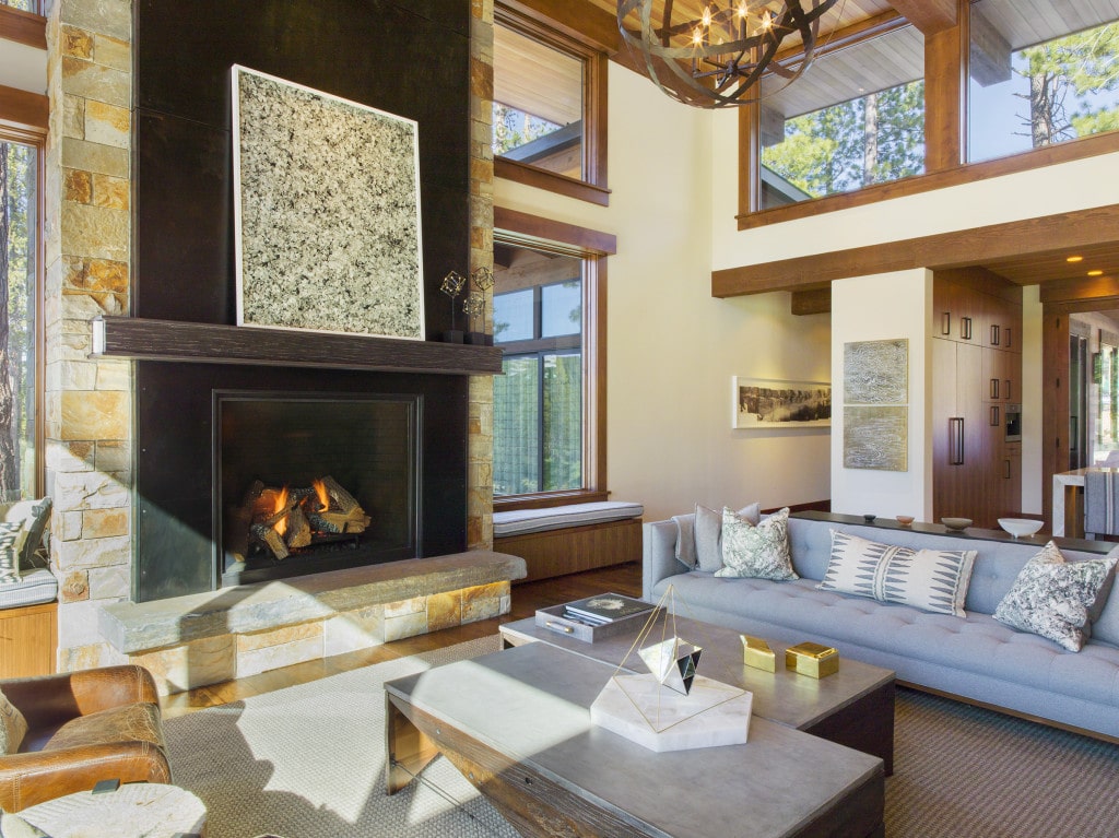
Ken Fandell, Mark Klett, Nancy Lorenz, and Andy Diaz Hope (on table) installation. photo: Ned Bonzi
Other artists in the collection: Sebastian Bremer, Val Britton, Chris Duncan, Steve Fitch,Lucas Foglia, Linda Geary, Andrew Holmquist, Pamela Jorden, and Paul Wackers.
